Simulating data
Better Code, Better Science: Chapter 9, Part 2

This is a possible section from the open-source living textbook Better Code, Better Science, which is being released in sections on Substack. The entire book can be accessed here and the Github repository is here. This material is released under CC-BY-NC-ND.
In this post I will continue the discussion of simulation, focusing on how to generate simulated data from a mathematical model or existing data.
Simulating data from a model
In some cases, we want to simulate data that have particular structure in order to test whether our code can properly identify the structure in the data. Depending on the kind of structure one needs to create, there are often existing tools that can help generate the data. For example, the scikit-learn package has a large number of data generators that are often useful, either on their own or as a starting point to develop a custom generator. Similarly, the NetworkX graph analysis package has a large number of graph generators available.
Let’s say that we have developed a tool that implements a novel method for the discovery of causal relationships from timeseries data. We would like to generate data from a known causal graph (which is represented as a directed acyclic graph, just like our workflow graphs in the previous chapter). For this, we can use an existing graph; I chose one based on a dataset of gene expression in E. coli bacteria that was used by Schafer & Strimmer (2005) and is shared via the pgmpy package:
from IPython.display import Image
from pgmpy.utils import get_example_model

# Load the model
ecoli_model = get_example_model('ecoli70')

# Visualize the network and save to an image file
viz = ecoli_model.to_graphviz()
viz.draw(IMAGE_DIR / 'ecoli.png', prog='dot')
Figure 1 shows the resulting rendering of that network, which has 46 nodes (representing individual genes) and 70 directed edges (representing causal relationships on gene expression between nodes).
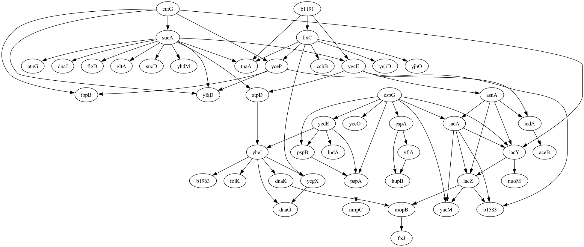
Figure 1. A plot of the graphical model for the E. Coli gene expression data generated by Schafer & Strimmer, 2005.
Given this DAG, we then need to generate timeseries data for expression of each gene that reflect the causal relationships between the genes as well as the autocorrelation in gene expression within genes measured over time. For this, we turn to the tigramite package, which is primarily focused on causal discovery from timeseries data, but also includes a function that can generate timeseries data given a graphical model. However, the tigramite package requires a different representation of the graphical model than the one obtained from pgmpy, so we have to convert the edge representation from the original to the link format required for tigramite:
def generate_links_from_pgmpy_model(model, coef=0.5, ar_param=0.6):
    nodes, edges = model.nodes(), model.edges()
    noise_func = lambda x: x
    links = {}

    # create dicts mapping node names to indices and vice versa
    node_to_index = {node: idx for idx, node in enumerate(nodes)}
    index_to_node = {idx: node for node, idx in node_to_index.items()}

    # add edges from the pgmpy model
    for edge in edges:
        cause = node_to_index[edge[0]]
        effect = node_to_index[edge[1]]
        # for simplicity, use lag 1, constant coef and no edge noise
        links.setdefault(effect, []).append( ((cause, -1), coef, noise_func) )

    # add a self-connection to all nodes to simulate autoregressive behavior
    for node in nodes:
        idx = node_to_index[node]
        links.setdefault(idx, []).append( ((idx, -1), ar_param, noise_func) )

    return links, node_to_index, index_to_node
We can then create a function to take in the original model, convert it, and generate timeseries data for the model:
def generate_data(model, noise_sd=1, tslength=500, seed=42, coef=0.5, ar_param=0.6):
    links, node_to_index, index_to_node = generate_links_from_pgmpy_model(model,
        coef=coef, ar_param=ar_param)
    rng = np.random.default_rng(seed)
    # Calculate total length including transient period
    data, _ = structural_causal_process(links, T=tslength, seed=seed)
    data = rng.normal(scale=noise_sd, size=data.shape) + data
    # Prepare data for tigramite
    return DataFrame(data), index_to_node

# we will need the index_to_node mapping later
ecoli_dataframe, _, index_to_node = generate_data(ecoli_model, noise_sd=1,
    tslength=500, seed=42)
Now that we have the dataset we can test out our estimation method. Since I don’t actually have a new method for causal estimation on timeseries, I will instead use the PCMCI method described by Runge et al, 2019 and implemented in the tigramite package:
from tigramite.pcmci import PCMCI
from tigramite.independence_tests.parcorr import ParCorr

def run_pcmci(dataframe):
    # Initialize PCMCI with partial correlation-based independence test
    pcmci = PCMCI(dataframe=dataframe, cond_ind_test=ParCorr())
    # Run PCMCI to discover causal links
    results = pcmci.run_pcmci(tau_max=1, pc_alpha=None)
    return results

results = run_pcmci(ecoli_dataframe)
The results from this analysis include a list of all of the edges that were identified from the data using causal discovery, which we can summarize to determine how well the model performed. First we need to extract the links that were discovered from the results which pass our intended false discovery rate threshold:
def extract_discovered_links(results, index_to_node, q_thresh=0.00001):
    discovered_links = []
    fdr_p = results['fdr_p_matrix'][:, :, 1]  # use only lag 1 p-values
    links = np.where(fdr_p < q_thresh)
    for (i, j) in zip(links[0], links[1]):
        if not i == j:
            discovered_links.append((index_to_node[i], index_to_node[j]))
    return discovered_links

discovered_links = extract_discovered_links(results, index_to_node, .01)
Then we can summarize the results:
def get_edge_stats(edges, discovered_links, verbose=True):
    true_edges = set(edges)
    discovered_edges = set(discovered_links)
    true_positives = true_edges.intersection(discovered_edges)
    false_positives = discovered_edges.difference(true_edges)
    false_negatives = true_edges.difference(discovered_edges)

    true_positive_rate = len(true_positives) / len(true_edges) if len(true_edges) > 0 else 0

    # Precision: proportion of discoveries that are true
    precision = len(true_positives) / len(discovered_edges) if len(discovered_edges) > 0 else 0

    # False Discovery Rate: proportion of discoveries that are false
    false_discovery_rate = len(false_positives) / len(discovered_edges) if len(discovered_edges) > 0 else np.nan

    f1_score = (2 * len(true_positives)) / (2 * len(true_positives) + \
        len(false_positives) + len(false_negatives)) if (len(true_positives) + len(false_positives) + len(false_negatives)) > 0 else np.nan

    if verbose:
        print(f'{len(true_edges)} true edges')
        print(f'discovered {len(discovered_edges)} edges')
        print(f"True Positive Rate (Recall): {true_positive_rate:.2%}")
        print(f"Precision: {precision:.2%}")
        print(f"False Discovery Rate: {false_discovery_rate:.2%}")
        print(f"F1 Score: {f1_score:.2%}")

    return {
        'true_positives': true_positives,
        'false_positives': false_positives,
        'false_negatives': false_negatives,
        'true_positive_rate': true_positive_rate,
        'precision': precision,
        'false_discovery_rate': false_discovery_rate,
        'f1_score': f1_score
    }

edge_stats = get_edge_stats(ecoli_model.edges(), discovered_links)
70 true edges
discovered 87 edges
True Positive Rate (Recall): 100.00%
Precision: 80.46%
False Discovery Rate: 19.54%
F1 Score: 89.17%
The results showed that the model performed quite well, detecting all of the true relationships and only two false relationships. In general we would want to do additional validation to make sure that the results behave in the way that we expect. For example, we would expect better model performance with stronger signal, and we would expect fewer nodes identified when the p-value threshold is more stringent. We can use the functions generated above to run a simulation of this:
# loop over signal levels and q values to see effect on performance

noise_sd = 1
tslength = 500
q_values =  [1e-6, 1e-5, 1e-4, 1e-3, 1e-2]
signal_levels = np.arange(0, 0.7, 0.1)
performance_results = []

for signal_level in signal_levels:
    dataframe, index_to_node = generate_data(ecoli_model, noise_sd=noise_sd, tslength=tslength, seed=42, coef=signal_level, ar_param=0.6)
    results = run_pcmci(dataframe)
    for q in q_values:
        discovered_links = extract_discovered_links(results, index_to_node, q_thresh=q)
        edge_stats = get_edge_stats(ecoli_model.edges(), discovered_links, verbose=False)
        performance_results.append({
        'noise_sd': noise_sd,
        'q_value': q,
        'tslength': tslength,
        'signal_level': signal_level,
        'true_positive_rate': edge_stats['true_positive_rate'],
        'precision': edge_stats['precision'],
        'false_discovery_rate': edge_stats['false_discovery_rate'],
        'f1_score': edge_stats['f1_score']
    })

performance_df = pd.DataFrame(performance_results)
We can then plot these results, as shown in Figure 2. The results confirm that the model is performing as expected, with increasing recall as a function of increasing true signal and decreasing FDR threshold.
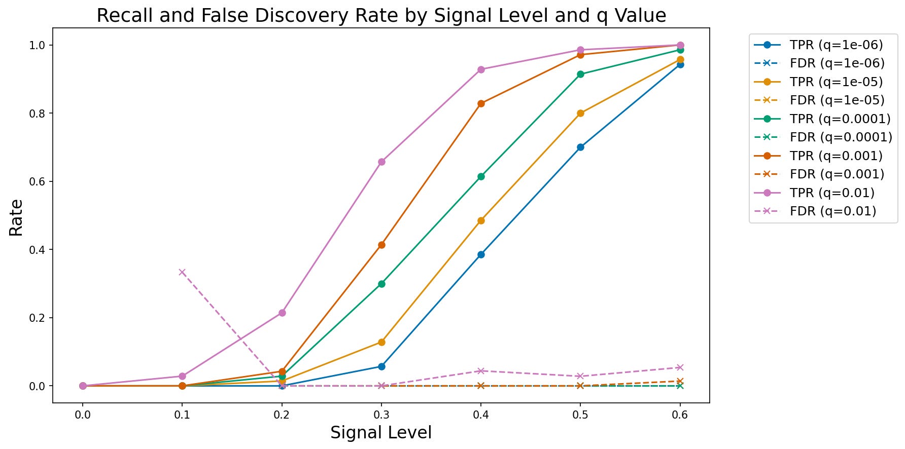
Figure 2. A plot of observed true positive rate (TPR) and false discovery rate (FDR) at increasing signal levels for varying FDR thresholds.
Simulating data based on existing data
It’s very common for researchers to collect a dataset of interest and then develop code that implements their analysis on that dataset to ask their questions of interest. However, this approach raises a concern that the choices made in the course of analysis might be biased by the specific features of the dataset (Gelman & Loken, 2019). In particular, decisions might be made that reflect the noise in the dataset, rather than the true signal, which is often referred to as overfitting (discussed further below). In some fields (particularly in physics) it is common to perform blind analysis (MacCoun & Perlmutter, 2015), in which analysts are given data that are either modified or relabeled, in order to prevent them from being biased by their hypotheses. One way to achieve this in the context of data analysis is to develop the code using a simulated dataset that has some of the same features as the real dataset, such that one can implement the code, validate it, and then immediately apply it to the real data once they are made available. To achieve this, one needs to be able to generate simulated data based on an existing dataset; for blind analysis, the generation of the simulated data should be performed by a different member of the research team. For example, in some cases I have generated the simulated data for a study based on the real data and provided those to my students, only providing them with the real data once the code was implemented and validated.
The important question in generating simulated data from real data is what specific features one intends to capture from the real data. This generally will require some degree of domain expertise in order to understand the features of the data. Some common features that one might wish to replicate are:
Data types (e.g. categorical, integer, floating point)
Marginal distributions of the values (minimally the range, preferably the shape or summary statistics)
Joint distributions of the variables (e.g. capturing correlations between variables)
It’s generally important to avoid including features in the model that are directly relevant to the hypothesis. For example, if the hypothesis relates to correlations between specific variables in the dataset, then the correlation in the simulated data should not be based on the correlation in the real data, lest the analysis be biased.
Here I will focus primarily on tabular data; while there are simulators to generate more complex types of data, such as genome wide association data and functional magnetic resonance imaging data, these require substantial domain expertise to use properly, whereas tabular data are widely applicable. For simple datasets it may be most appropriate to generate simulated data by hand; here I will use the Synthetic Data Vault (SDV) Python package, which has powerful tools for generating many kinds of synthetic data.
As an example, I will use the Eisenberg et al. (2018) data that you have already seen on a couple of occasions. I’ll start by picking out a few variables and then using SDV to create a synthetic dataset whose distributions for each variable match those in the original, but the columns are generated independently, which removes any correlations between columns. The full analysis is shown here. After loading and combining the demographic and behavioral data frames, selecting a few important variables, and joining them into a single frame (df_orig), I then use SDV to generate simulated data for each variable, shuffling each column after generation to destroy any correlations:
from sdv.single_table import GaussianCopulaSynthesizer
from sdv.metadata import Metadata

def generate_independent_synthetic_data(df, random_seed=42):
    """
    Generate synthetic data where all variables are independent.

    Uses SDV to model the full dataset, then shuffles each column
    independently to break all correlations while preserving marginal distributions.

    Parameters:
    -----------
    df : pd.DataFrame
        Original dataframe to generate synthetic version of
    random_seed : int, optional
        Random seed for reproducibility (default: 42)

    Returns:
    --------
    pd.DataFrame
        Synthetic dataframe with same shape and column names as input,
        but with independent variables
    """
    # Suppress the metadata saving warning
    warnings.filterwarnings('ignore', message='We strongly recommend saving the metadata')

    # Set random seed
    if random_seed is not None:
        np.random.seed(random_seed)

    # Create metadata for the full dataset
    metadata = Metadata.detect_from_dataframe(
        data=df,
        table_name='full_data'
    )

    # Create synthesizer for the full dataset
    synthesizer = GaussianCopulaSynthesizer(
        metadata,
        enforce_rounding=False,
        enforce_min_max_values=True,
        default_distribution='norm'
    )

    # Fit synthesizer to the full dataset
    synthesizer.fit(df)

    # Generate synthetic data
    df_synthetic = synthesizer.sample(num_rows=len(df))

    # CRITICAL: Shuffle each column independently to break all correlations
    # This preserves the marginal distribution of each variable but eliminates dependencies
    for col in df_synthetic.columns:
        shuffled_values = df_synthetic[col].values.copy()
        np.random.shuffle(shuffled_values)
        df_synthetic[col] = shuffled_values

    return df_synthetic
We can then visualize the correlations and distributions for the original data and the synthetic data; in Figure 3 we see that the distributions in the synthetic data are very similar to those in the original data, while in Figure 4 we see that the synthetic data do not include the original correlations.
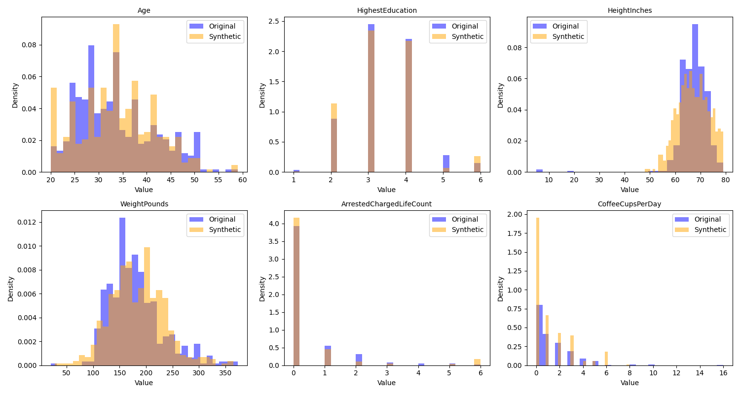
Figure 3. A comparison of the distributions of the original and synthetic data for several of the variables in the example dataset.
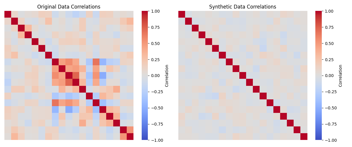
Figure 4. A comparison of the correlations matrices for the numeric variables in the original and synthetic data.
The SDV package also offers many additional tools for more sophisticated generation of synthetic data. In subsequent sections I will show additional ways to use synthetic data for validation of scientific data analysis code.